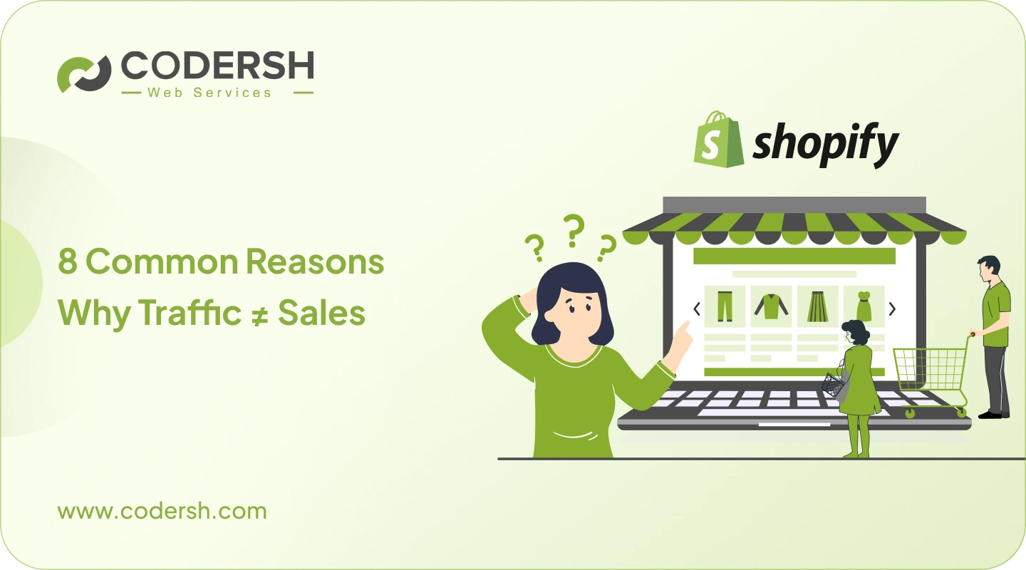
If your Shopify store is getting visitors but sales aren’t following, you’re definitely not alone.
This is one of the most common situations DTC brands face where ads are running, and traffic numbers look fine. Also, analytics shows people are landing on your store and browsing around.
Yet orders remain low.
Naturally, this pushes most store owners to do more with more ads, more targeting tweaks, more apps and more offers.
But in most cases, the real problem isn’t traffic at all.
The real reason most Shopify stores struggle to convert is much simpler, and it’s often harder to spot. And that is: “Visitors are not feeling confident enough to buy”.
Let’s break down what’s actually happening and what should be done to fix it.
1. Traffic Doesn’t Buy, Confidence Does.
Visitors don’t come to your store to analyze it logically; they make fast, emotional decisions, often within the first few seconds.

Almost instantly, they’re subconsciously asking themselves a few questions:
- Does this store feel trustworthy?
- Is this product really meant for me?
- Will buying here be easy and safe?
These thoughts don’t appear as clear sentences in their head, but they influence every click, scroll, and pause.
If even one of those answers feels uncertain, they leave.
Sometimes they bounce right away. Other times they browse for a while, open a product page, maybe even add something to the cart, and then disappear without warning. From the outside, it looks like “lost traffic.” In reality, it’s lost confidence.
Online shopping always carries a small amount of risk in the customer’s mind. They can’t touch the product, talk to a salesperson, or walk into a physical store if something goes wrong. So their brain looks for reassurance everywhere, in the design, the words you use, the photos, the layout, the checkout flow, and even the speed of the site.
When a store feels unclear, cluttered, outdated, or inconsistent, it creates silent doubt. Not enough to make someone angry, but just enough to make them hesitate. And hesitation is the enemy of conversion.
People don’t come to you and say, “I didn’t buy because the trust signals were weak” or “the layout made me unsure.” They just close the tab and move on. The decision feels small to them, but it’s a lost sale for you.
That’s why conversion problems are often confidence problems in disguise. Before users compare prices or features, they’re deciding whether your store feels reliable enough to deserve their money.
2. Your Homepage Should Guide, Not Impress
Many Shopify homepages look visually impressive, but that doesn’t mean they work.

A homepage isn’t meant to showcase design skills or creative effects. Its job is much simpler and much more important. It should quickly explain what you sell, who it’s for, and why it matters right now.
When a new visitor lands on your store, they’re not in “exploration mode”; they’re in “orientation mode”. They’re trying to understand where they are and whether it’s worth their attention. If that clarity doesn’t come within a few seconds, they start scrolling without direction, clicking randomly, or leaving altogether.
This is where many stores lose potential buyers. The page might look beautiful, but if the message is vague, users are forced to overthink. And when online shoppers have to think hard, they usually just exit.
A strong homepage reduces mental effort. It acts like a guide, not a gallery. It reassures visitors that they’re in the right place and shows them exactly where to go next, whether that’s exploring a product category, learning more about a solution, or viewing a best-seller.
Overloaded banners, too many competing offers, auto-sliders, and abstract taglines often do more harm than good. Instead of helping people move forward, they create noise. And noise leads to hesitation.
Clear headlines, simple structure, focused visuals, and obvious next steps make users feel comfortable. When visitors feel guided instead of overwhelmed, they’re far more likely to continue browsing, and eventually to buy.
3. Product Pages Need to Help People Decide
Most product pages list features fairly well, and that’s usually not where things go wrong.

The real issue is that features alone rarely help someone make a buying decision. Specs inform, but they don’t convince. Shoppers aren’t just comparing numbers or materials; they’re trying to picture what life looks like after they own the product.
Visitors want to understand how the product fits into their routine, what problem it actually solves, and whether it’s truly worth the price. At the same time, they’re quietly looking for reassurance. They want to feel confident that they won’t regret the purchase or feel disappointed when it arrives.
When a product page doesn’t address these emotional and practical doubts, people hesitate. They scroll, they read a bit, maybe they even select a variant, but they don’t feel ready to commit. That’s when the familiar thought appears: “I’ll think about it later.” And in eCommerce, “later” usually means never.
Strong product pages go beyond describing what the product is. They show what the product does for the customer. They highlight outcomes, real-life use, and relatable scenarios that make the value feel obvious. Clear visuals, helpful descriptions, and subtle reassurance all work together to reduce uncertainty.
Good product pages don’t pressure people into buying. They remove the reasons not to buy. And when hesitation fades, saying “yes” feels like the natural next step.
4. Too Many Choices Often Kill Conversions
It feels logical to offer more options, more variants, more bundles, more popups, and more deals. From a store owner’s perspective, it seems like giving customers flexibility should increase the chances of a sale.

But online behaviour doesn’t always work that way.
When users are presented with too many decisions at once, their mental effort increases. Instead of feeling empowered, they start feeling unsure. Which variant is best? Is this bundle really a good deal? Should they pick this offer or wait for a better one? That small wave of uncertainty quickly turns into hesitation.
And when people hesitate online, they rarely pause to think it through, They leave.
Too many choices also makes the store feel noisy. Competing banners, multiple discounts, and constant popups pull attention in different directions. Instead of guiding the visitor forward, the store creates friction disguised as opportunity.
Simplifying the experience often has a bigger impact than adding more incentives. Highlighting one clear recommendation, reducing unnecessary variants, and cleaning up visual clutter helps people move forward with confidence. When the path feels obvious, decisions feel easier, and easier decisions lead to more conversions.
5. Mobile Experience Isn’t Optional Anymore
Most Shopify traffic now comes from mobile devices, yet many stores still feel like they were designed with desktop in mind first and mobile as an afterthought.
That mismatch quietly hurts conversions.
On mobile, small usability issues feel much bigger. Buttons that are slightly hard to tap, text that feels cramped, long walls of content without clear breaks, or popups that take over the screen can quickly frustrate users. Add slow loading on top of that, and the experience starts to feel like job work instead of shopping.
Mobile users are usually multitasking, distracted, or browsing in short bursts. They don’t have the patience to zoom, adjust, or “figure things out.” If something feels even slightly inconvenient or confusing, they exit without overthinking it and often never return.
A good mobile experience feels effortless. Clear buttons, simple layouts, fast loading, and obvious next steps help users move naturally from browsing to buying. When mobile feels smooth, conversions follow.
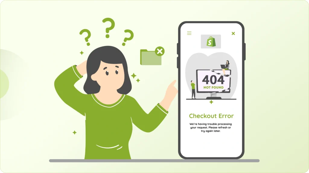
6. Checkout Hesitation Is About Uncertainty, Not Difficulty
Shopify’s checkout system is already well built. Most customers don’t abandon because checkout is “broken.” They leave because something feels uncertain at the worst possible moment.
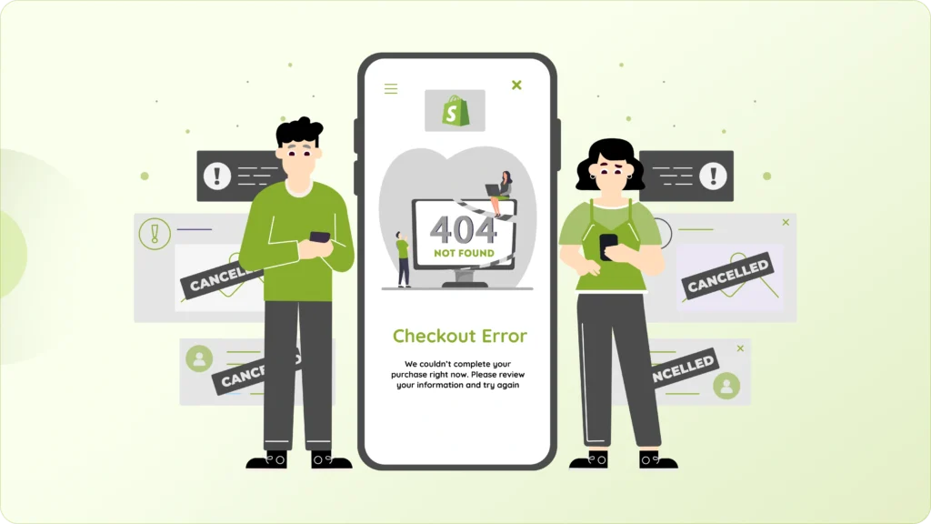
Right when users are ready to pay, even small doubts can stop them. Surprise shipping costs, unclear delivery timelines, too many required form fields, or not knowing what happens after payment can all create hesitation. It’s not about effort; it’s about confidence.
Checkout should feel calm, predictable, and reassuring. Shoppers should never feel like they’re walking into the unknown. Clear cost breakdowns, simple forms, visible security cues, and familiar payment options all work together to make the final step feel safe.
When customers know exactly what’s coming next, they stop second-guessing and start completing purchases.
7. Trust isn’t a Section, it’s an Experience.
Trust doesn’t come from a single testimonial or a security badge sitting quietly in the footer. It’s something visitors feel as they move through your store, step by step.
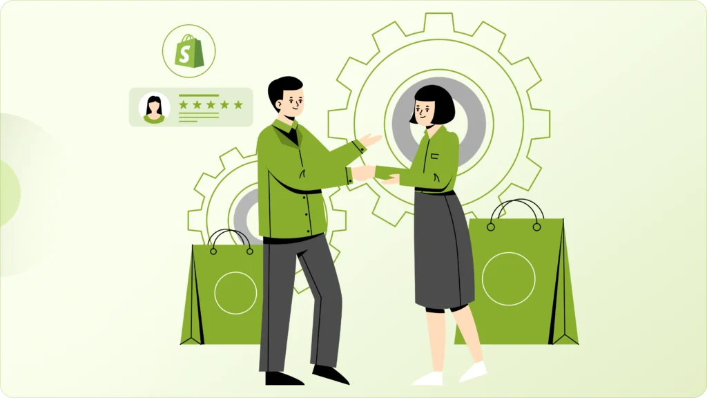
It’s built through consistency. A clean and professional design, clear policies that are easy to find, genuine customer reviews, familiar payment options, and confident, human copy all work together to create that sense of reliability. When everything feels aligned and intentional, people feel safer buying.
Trust is also about removing small doubts before they grow. If policies are hard to find, product details feel vague, or the design looks inconsistent, visitors start questioning things. Even if they don’t consciously notice the issue, it affects their confidence.
When trust signals are missing, scattered, or only appear at the very end, buyers tend to pause at the worst possible moment, right before payment. Strong stores don’t try to “add” trust at checkout. They build it naturally throughout the entire experience.
8. Speed Still Shapes Perception
Performance isn’t just a technical metric; it’s emotional.
A fast-loading store feels reliable, professional, and safe. A slow store, even if it looks good, creates a subtle sense of doubt. Visitors may not say, “This site is slow, so I don’t trust it,” but that’s often exactly what’s happening beneath the surface.
Speed directly affects momentum. When pages load instantly, users stay in a buying mindset. When there’s even a short delay, that momentum breaks. They get distracted, second-guess their decision, or simply lose patience.
Even a one-second delay can lower conversions because online attention spans are incredibly short. Today’s shoppers are used to instant responses. If your store feels even slightly sluggish, they don’t wait to see if it improves; they move on to the next option.
Speed also influences how people perceive your brand. Faster sites feel more established and dependable. Slower ones feel outdated or less trustworthy, even if the products are great.
Improving performance isn’t only about passing speed tests. It’s about protecting the buying mood and keeping the experience smooth from the first click to the final checkout.
The Real Fix: Remove Friction, Don’t Add More
When conversions drop, most brands react by adding more apps, more popups, more banners, more urgency messages. It feels productive, like you’re “doing something” to fix the problem.
But in reality, every extra element competes for attention and adds mental load. Instead of helping visitors decide, it often makes the experience noisier and more overwhelming.
Real growth usually comes from doing the opposite.
Removing friction means simplifying decisions, reducing distractions, and making the path to purchase feel obvious. It’s about guiding users, not pressuring them. When people don’t have to work to understand what to do next, they move forward more naturally.
Friction shows up in small ways like unclear messaging, too many choices, unexpected costs, slow pages, or cluttered layouts. None of these feels dramatic on their own, but together they quietly drain conversions.
Conversion optimization isn’t about clever tricks or aggressive persuasion. It’s about clarity. When your store feels easy to understand, easy to trust, and easy to buy from, sales follow without forcing the decision.
When Doubts Disappear, Sales Follow
If your Shopify store isn’t turning traffic into sales, the solution usually isn’t to push more visitors through the door. More traffic won’t help if the experience still leaves people unsure.

In most cases, what’s really needed is clearer messaging, simpler user flows, stronger trust signals, faster performance, and an overall experience that feels effortless. Small improvements in these areas often have a bigger impact than big marketing spends.
Shoppers don’t abandon stores because they enjoy comparing options forever. They leave when something feels uncertain, confusing, or risky. Every unanswered question becomes a reason to delay the purchase.
But when your store quietly answers concerns before they turn into doubts, the entire experience changes. Visitors feel comfortable moving forward. Decisions feel easier. Buying feels like the natural next step.
And that’s when traffic finally starts turning into consistent, reliable sales.
Want Us to Fix the Invisible Conversion Blocks in Your Store?
This is just an overview of our Shopify CRO and optimization service.
We audit your store end to end, identify hidden friction points, and improve user flow, trust, speed, and decision clarity, without bloating your store with unnecessary apps or gimmicks.