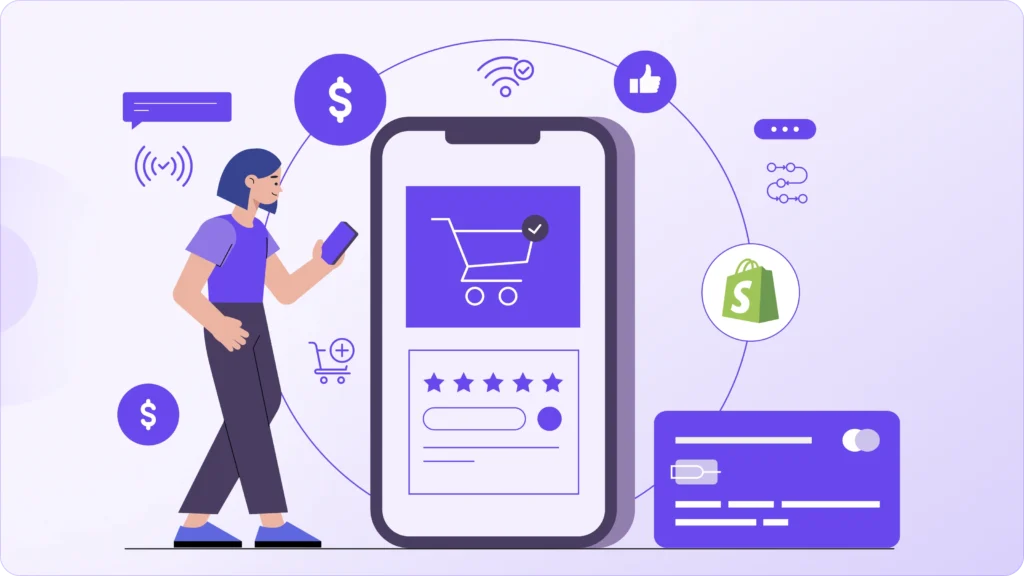
By the time someone reaches checkout, they’ve already done the hard part. They’ve browsed, compared, and decided your product is worth their money. That’s real buying intent. But checkout is where hesitation sneaks in. A small moment of confusion, an unexpected cost, or a missing reassurance can be enough to stop the purchase entirely.
When doubt shows up this late in the journey, shoppers rarely try to “figure it out.” Online behavior is simple: if something feels off, they close the tab. Not because they changed their mind about the product, but because the process no longer feels smooth, safe, or predictable.
This is why checkout optimization is so powerful. You’re not trying to convince someone to want the product; you’re simply making it easier for them to complete a decision they’ve already made. Even minor improvements here can have a bigger impact than redesigning your homepage or increasing ad spend.
You should think of checkout as a confidence checkpoint. Every step should quietly reassure the customer that they’re making the right choice, that there are no surprises ahead, and that their payment and personal details are secure. When checkout feels calm and straightforward, people move forward naturally.
The good news is that this doesn’t require a full store overhaul. You don’t need flashy tactics or aggressive tricks. Instead, focus on removing friction, clarifying expectations, and reinforcing trust at key moments in the checkout flow. These small, intentional adjustments often unlock some of the fastest and most measurable conversion gains in an eCommerce store.
Here’s how checkout optimization actually works when you approach it with that mindset.
1. Checkout Optimization Starts Before Checkout Ever Loads
One of the biggest misconceptions is thinking checkout optimization begins on the checkout page itself.
It doesn’t. It starts the moment someone clicks “Add to Cart.”
From that point on, shoppers are mentally moving toward payment. If key details are missing during this stage, uncertainty builds quietly in the background. By the time they reach checkout, that uncertainty turns into hesitation.
Costs are the most common trigger. If shipping fees, taxes, or delivery timelines suddenly appear at the final step, it feels like a surprise, even if the numbers are reasonable. Surprises at checkout don’t feel neutral; they feel risky.
You should make expectations clear earlier in the journey. Shipping ranges, delivery estimates, return policies, and payment options should be visible on product pages or in the cart. When shoppers already understand the total picture, checkout feels like a confirmation, not a negotiation.
Trust also needs to be built before checkout loads. Reviews, guarantees, secure payment icons, and clear support access help shoppers feel safe long before they enter their card details. Without this foundation, the checkout page has to work much harder to convince them.
When expectations are set early, the checkout step feels simple. Shoppers aren’t calculating or second-guessing; they’re just completing a decision they already feel good about.
2. The Small Frictions That Quietly Kill Conversions
Most checkout problems don’t look like problems. There’s no error message, no broken button, no obvious failure. Instead, there’s just a slight pause… then another… and eventually, abandonment.
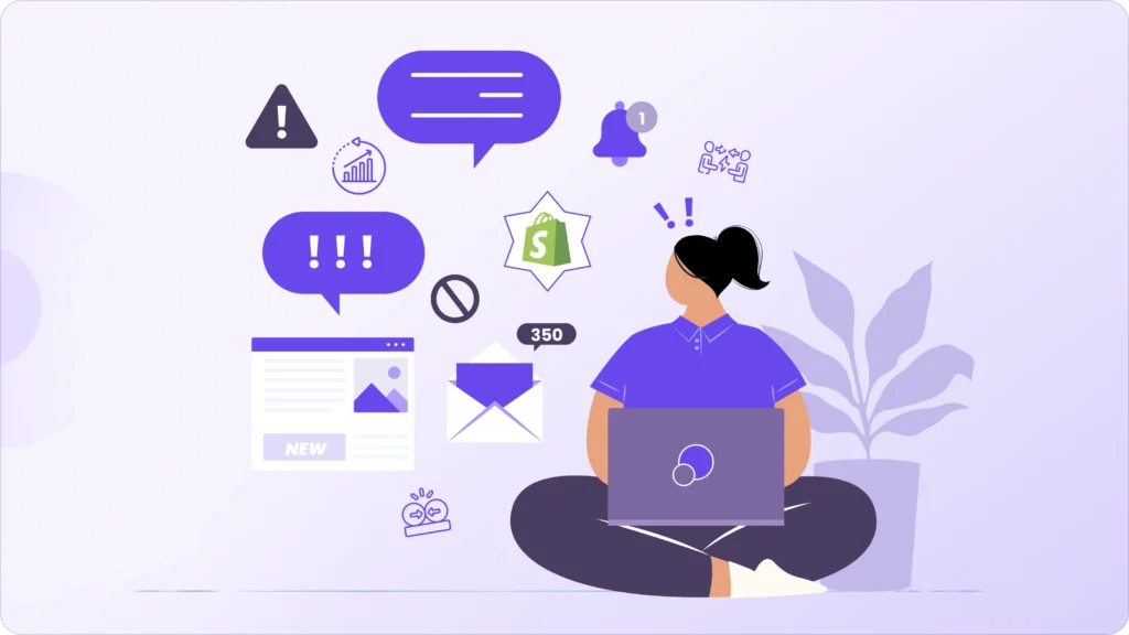
These pauses usually come from small bits of friction that stack up. Extra form fields that don’t feel necessary. Instructions that aren’t completely clear. Dropdowns that make people stop and think. None of these feel serious on their own, but together they create mental fatigue right at the moment someone is supposed to feel confident and decisive.
Checkout should feel lighter with every step, not heavier.
You should regularly review every required field and ask a simple question: Does this information directly help fulfill the order? If not, it’s probably adding friction. The fewer decisions and typing tasks shoppers face, the smoother the path to payment becomes.
Practical improvements make a big difference here. Enable address auto-complete so users don’t have to type everything manually. Use smart defaults where possible. Avoid forcing account creation before purchase; let people check out as guests and invite them to create an account afterward instead.
Clarity matters just as much as simplicity. Field labels, error messages, and instructions should feel obvious, not technical. When shoppers don’t have to stop and interpret what you’re asking for, they stay in momentum.
Less typing means less time to reconsider. And at checkout, maintaining momentum is often the difference between a completed order and a lost one.
3. Guest Checkout Isn’t Optional Anymore
Requiring account creation before checkout is one of the fastest ways to lose ready-to-buy customers.
At this stage, shoppers aren’t looking to build a relationship; they’re trying to complete a purchase quickly and safely. When they’re forced to set up a password, confirm details, or think about “creating an account,” it feels like extra work at the worst possible moment.
Buying should feel easy, not like signing up for something.
You should make guest checkout the default path and keep it clearly visible. The fewer barriers between cart and payment, the higher the completion rate tends to be. People are far more willing to share information after they’ve successfully received their order and trust your brand.
That’s why the smarter flow is to invite account creation after checkout, not before. Once the purchase is done, you can offer to save their details for faster future orders, order tracking, or exclusive benefits. At that point, it feels helpful instead of demanding.
Removing forced account creation doesn’t reduce long-term customer relationships; it actually improves them. When the first experience is smooth and pressure-free, shoppers are much more likely to come back and choose to create an account on their own.
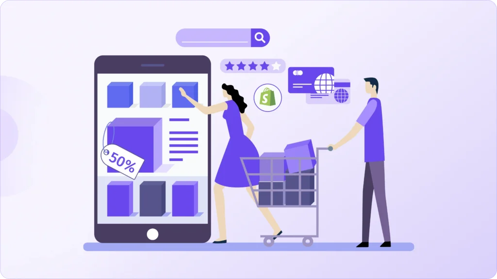
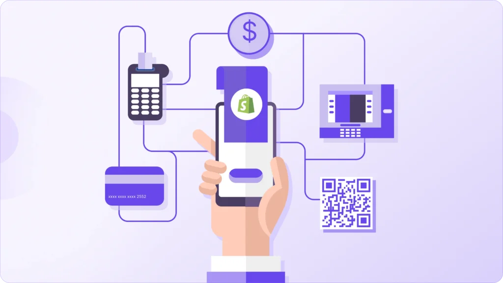
4. Payment Options Can Make or Break the Sale
Payment friction is easy to overlook, but it plays a huge role in whether a customer finishes their order or drops off at the last step.
You can do everything right, strong product pages, smooth cart flow, clear pricing and still lose the sale if shoppers don’t see a payment method they trust or prefer. At checkout, people want familiarity and speed. If they have to reach for their wallet, switch devices, or look up card details, hesitation creeps in.
That’s why you should prioritize fast, recognizable options like Shop Pay, Apple Pay, Google Pay, and PayPal, especially for mobile users. These methods reduce typing, feel secure, and help customers complete purchases in seconds instead of minutes.
But more isn’t always better. When checkout is crowded with too many logos and unfamiliar gateways, it can actually slow decision-making. Shoppers start wondering which option is safest or most reliable, and that pause is where abandonment happens.
Your goal should be to offer a focused set of widely trusted payment methods that match your audience and region. Keep the layout clean, make the primary options obvious, and remove anything rarely used.
Checkout should feel quick, familiar, and effortless, not like choosing from a long menu of financial tools.
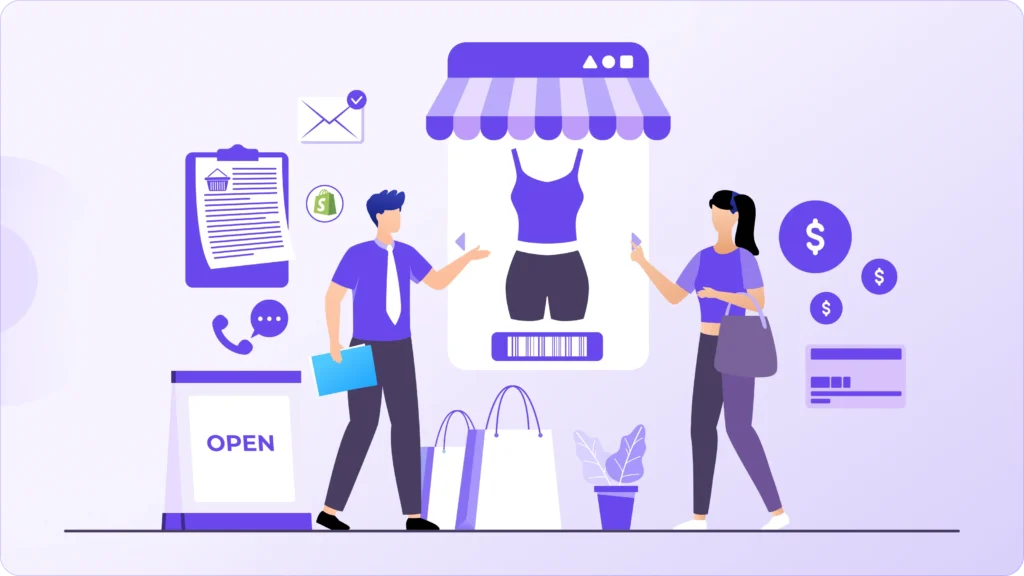
5. Checkout Should Feel Like the Same Store
One subtle conversion killer is when checkout feels like a completely different environment from the rest of your store.
Your product and cart pages might feel polished, on-brand, and thoughtfully designed, and then suddenly, checkout looks generic, overly technical, or emotionally flat. That shift can make shoppers pause, even if they don’t consciously realize why. And at this stage, even a small moment of uncertainty can derail the purchase.
You should aim for visual and tonal continuity. Brand colors, logo presence, font style (where possible), and overall tone of voice should carry through so customers feel like they’re still in the same trusted space. Even small touches like friendly microcopy, consistent button language, or reassurance messages in your brand voice help maintain that sense of familiarity.
Trust grows with consistency. When checkout feels like a natural extension of your store rather than a separate system, customers stay in buying mode instead of shifting into caution mode.
Paying shouldn’t feel like being sent somewhere else; it should feel like the final step in a smooth, familiar journey.
6. Shipping Transparency Builds Confidence
Unexpected shipping costs remain one of the fastest ways to lose a ready-to-buy customer.
This doesn’t mean you must offer free shipping. It means you should remove uncertainty. Shoppers hesitate when totals suddenly jump or when delivery timing feels vague. That hesitation often turns into abandonment.
Set expectations early and repeat them clearly. Highlight shipping costs (or free-shipping thresholds) before checkout begins, not just at the final step. Show delivery estimates that feel realistic, not overly optimistic. Even a simple “Arrives in 3–5 business days” near the cart or checkout summary can steady a buyer’s confidence.
You should also make thresholds motivating instead of hidden. Messages like “You’re only 10$ away from free shipping” give shoppers a clear, positive next step rather than a negative surprise.
When costs and timelines are predictable, checkout feels safe. And when checkout feels safe, people finish what they started.
7. Preventing Errors Works Better Than Fixing Them
Most stores wait until something breaks, which directly exposes it to the customer. By then, frustration has already crept in.
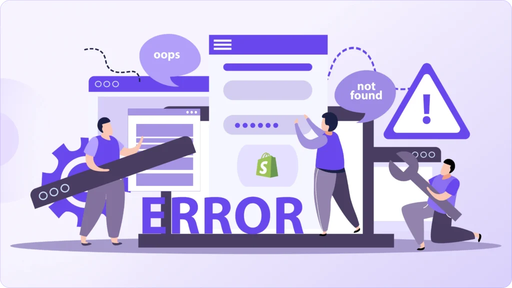
A smoother experience comes from stopping problems before they happen. You should guide shoppers in real time with clear field labels, smart formatting hints (like auto-spacing card numbers), and instant validation that catches issues gently, not aggressively.
Small assists make a big difference: auto-detecting card type, suggesting correct address formats, or flagging a missing digit before the form is submitted. These micro-moments remove friction without the customer even noticing why things felt easy.
The goal isn’t to correct people; it’s to support them quietly. Every prevented error protects momentum, and momentum is what gets checkouts completed.
8. Trust Signals Matter Most at the Final Step
Trust elements don’t need to be loud or scattered across every page. Their biggest impact comes right when someone is about to enter payment details.
At that moment, shoppers are doing a quick internal risk check. You should answer those concerns quietly but clearly. Visible payment security indicators, a short reminder about easy returns, or a simple support contact nearby can steady nerves without adding clutter.
This is also where tone matters. Calm, clear language like “Secure checkout” or “Easy returns if it’s not right” works better than aggressive badges or overwhelming guarantees. The goal is reassurance, not pressure.
When trust is reinforced at the exact point of commitment, hesitation drops. And when hesitation drops, checkout completion rises naturally.
What do these changes actually deliver?
When you make these kinds of checkout improvements, the impact usually shows up faster than you expect.
Completion rates go up because fewer people drop off at the final step. Cart abandonment decreases because shoppers feel more certain, not rushed or confused. Mobile checkouts, which are often the weakest link, start performing much closer to desktop.
You’ll also notice more stability during sales campaigns or traffic spikes. Instead of checkout becoming a bottleneck, it holds steady because the experience is built around clarity and confidence, not complexity.
There’s no gimmick behind these results. You’re simply removing friction, setting better expectations, and making the last step of the buying journey feel safe and straightforward. And when checkout feels that way, more people follow through.
Checkout isn’t a Form; It’s a Decision Moment.
It’s easy to think of checkout as just a set of fields to fill out, but for shoppers, it’s much more than that. It’s the final moment where they pause and ask themselves, “Do I really feel good about this purchase?”
That’s why checkout optimization isn’t about visual polish alone. It’s about removing doubt right when money is about to change hands. Every unclear detail, unexpected cost, or small friction point gives people a reason to hesitate.
When checkout feels fast, predictable, and trustworthy, the experience feels safe. Shoppers don’t feel like they’re taking a risk; they feel like they’re simply completing something they’ve already decided to do.
If your store is getting traffic but sales aren’t where they should be, checkout is often the highest-impact place to focus. Small improvements here can unlock conversions you’re already paying to acquire.
Want Us to Optimize Your Shopify Checkout?
This is just a glance at our Shopify CRO and checkout optimization service.
We audit your checkout flow end to end, identify hidden friction points, and improve speed, clarity, and confidence, without overengineering or bloating your store with unnecessary apps.