It’s 2026 Mobile Responsiveness Is No Longer Optional. Now, responsive design isn’t a competitive advantage anymore. It’s the basic standard of the web.
We’re in the decade where Smartphones have become the primary browsing device. E-commerce, social media, search, ads; almost everything happens on mobile first. So if a store still isn’t mobile responsive, it’s not just a technical oversight. It signals that the website hasn’t kept up with even the most fundamental expectations of modern users.
Customers notice it immediately. Broken layouts, awkward scrolling, or tiny tap targets make a store feel outdated and unreliable. And the reality is simple: today, a non-responsive website doesn’t look unfinished; it looks neglected and unsafe.
Responsive design is already part of the foundation of any ecommerce store, just like secure payments, fast loading pages, and a clear checkout flow.
If a store is still struggling with mobile usability in 2026, it’s a clear sign that the experience needs serious attention.
What Responsive Design Actually Means
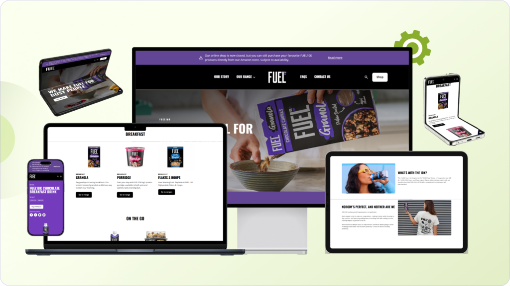
Responsive design simply means your website automatically adapts to the screen your customer is using.
Someone might visit your store on a laptop at work, scroll through products on their phone while commuting, or quickly check delivery estimates on a tablet at home. A responsive website adjusts its layout so the experience feels smooth on every screen size.
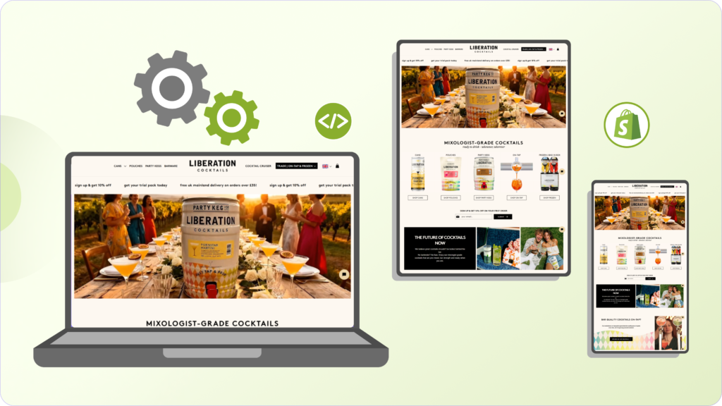
Instead of creating separate desktop and mobile versions of a website, responsive design uses flexible layouts and adaptive elements that reorganize themselves depending on the device.
For an ecommerce store, this has a direct impact on how people shop. Product images scale correctly, text stays readable without zooming, navigation menus adjust for smaller screens, buttons remain easy to tap, and the checkout process stays simple on mobile.
In simple words, responsive design ensures your ecommerce website works properly on mobile, tablet, and desktop, so customers can browse, add products to cart, and complete purchases without friction. In today’s mobile-first ecommerce environment, that consistency is what keeps visitors engaged and prevents them from leaving your store.
Mobile Traffic Is Already Dominating Ecommerce
Many ecommerce brands underestimate just how much traffic now comes from mobile devices.

Today, it’s very common that 60–80% of your store visitors comes through mobile devices. People discover products through social media, ads, and search results while casually scrolling on mobile. For many customers, the first interaction with your store happens on a small screen.
If your website isn’t designed for that experience, you’re essentially making the majority of your customers work harder just to shop. Small usability issues quickly turn into lost sales. Buttons that are difficult to tap, images that don’t fit properly on the screen, text that feels cramped or unreadable, and checkout forms which are frustrating to complete on a phone.
Most customers won’t try to push through that friction. They’ll simply leave and buy from another store that works smoothly on mobile. That’s exactly where responsive design makes a difference. It removes these barriers and ensures your store feels natural and easy to use, no matter what device your customer is holding.
Responsive Design Directly Affects Conversion Rates
A poorly optimized mobile experience doesn’t just look bad; it directly impacts your sales.

Think about how most customers discover products today. Someone sees your product on Instagram, a Google result, or an ad. They tap the link, land on your store, and start browsing on their phone.
At that moment, the experience needs to feel effortless.
If the layout feels clumsy, pages load slowly, or the interface doesn’t fit the screen properly, trust drops almost instantly. Customers start feeling like the site wasn’t built for their device, and that hesitation often leads to them leaving before they even reach checkout.
But when a store is properly responsive, everything feels natural. Product images adjust to the screen, text remains easy to read, important buttons stay visible, and checkout forms are simple to complete on mobile.
Individually, these may seem like small details. Together, they shape the entire buying experience. And in ecommerce, smoother experiences almost always lead to better conversions.
Google Also Prioritizes Mobile-Friendly Websites
Responsive design isn’t only about user experience. It also directly affects your SEO performance.
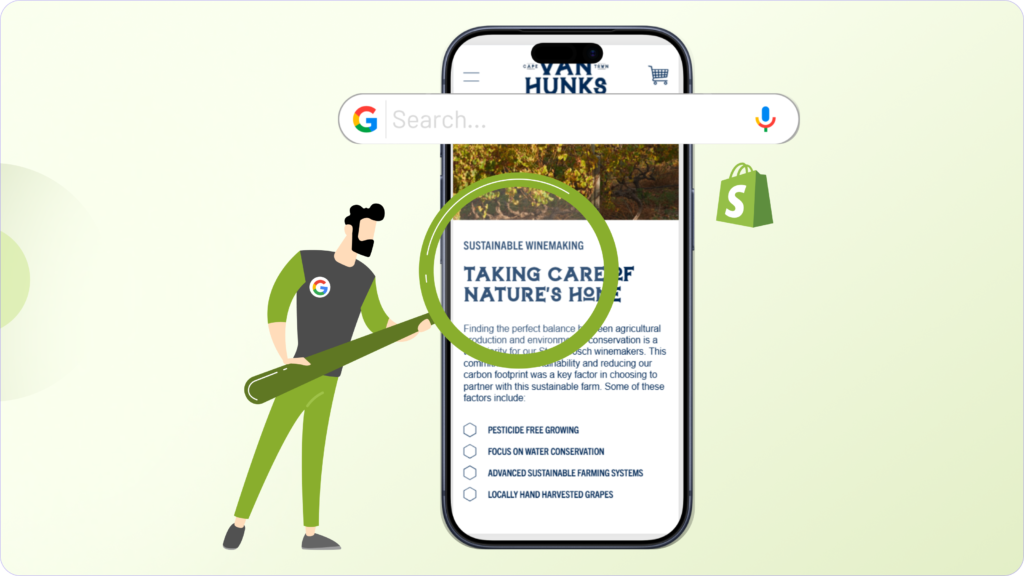
Today, Google mainly evaluates websites using mobile-first indexing. In simple terms, Google looks at the mobile version of your site first when deciding where it should rank in search results.
If your store performs poorly on mobile with slow loading pages, broken layouts, or difficult navigation, it can negatively affect your visibility on search.
A responsive website helps avoid these issues. Pages load faster, the layout stays usable across screen sizes, and visitors are less likely to leave immediately after landing on the site.
All of this sends stronger quality signals to search engines. So improving responsiveness doesn’t just make your store easier to use. It also helps your site perform better in search and attract more traffic at the same time.
Responsive Design Helps Maintain Brand Trust
Customers often form an opinion about a brand within seconds of landing on a website.
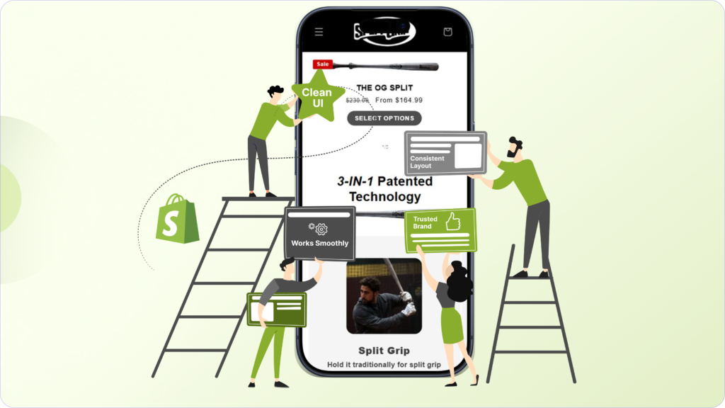
If the site feels broken, outdated, or difficult to use on mobile, it immediately creates doubt. Even if the product is good, a poor mobile experience can make the brand feel less reliable.
People naturally associate the quality of a website with the quality of the business behind it.
A responsive design helps avoid that problem. Your store looks clean, works smoothly, and feels consistent across devices, whether someone visits from a phone, tablet, or desktop.
Those small details quietly build trust, and in ecommerce, trust plays a big role in whether someone decides to buy or leave.
Checkout Experience Is Where It Matters Most
Many ecommerce stores spend a lot of time optimizing product pages, but the checkout experience is where responsive design really becomes critical.
On mobile, checkout can quickly turn frustrating if the layout isn’t designed properly. Small input fields, awkward dropdowns, and buttons that are hard to tap make the process feel slow and uncomfortable.
When that happens, customers rarely push through the friction. They simply abandon the purchase.
A well-designed responsive checkout removes those problems. Forms are easier to fill, buttons are large enough to tap comfortably, and the entire flow feels quicker and more natural on a phone.
These improvements may seem small, but they directly affect completion rates. In ecommerce, a smoother checkout often means more successful purchases.
It Future-Proofs Your Ecommerce Store
Devices aren’t static anymore. Screen sizes and browsing habits keep changing.
Today customers shop on phones, tablets, laptops, and large desktop monitors. New formats like foldable phones and different screen ratios are already becoming common.
A responsive ecommerce website is designed to adapt to these changes automatically. The layout adjusts, images scale correctly, and the overall experience remains consistent across devices.
Instead of rebuilding your store whenever a new device type appears, responsive design gives you a flexible foundation that continues to work as technology evolves.
The Bottom Line
Responsive design isn’t just about aesthetics; it affects SEO, usability, trust, and conversions.
Most ecommerce traffic now comes from mobile devices. If your store isn’t built to deliver a seamless experience on smaller screens, you’re introducing friction at the exact moment customers are ready to buy.
A responsive ecommerce store removes those barriers. It makes browsing easier, checkout smoother, and the overall shopping experience more reliable.
And in a competitive ecommerce landscape, that difference matters.
If your store isn’t fully optimized yet, don’t worry. Whether you want to improve conversions through CRO, redesign your existing store, or build a completely new custom Shopify store, we can help you get there.
Let’s talk.