Your Shopify store might look great, it loads fast, it passes speed tests, and Traffic is coming in.
And still… sales don’t match, which can make anyone scared because nothing is really broken, but something isn’t working the way it should.
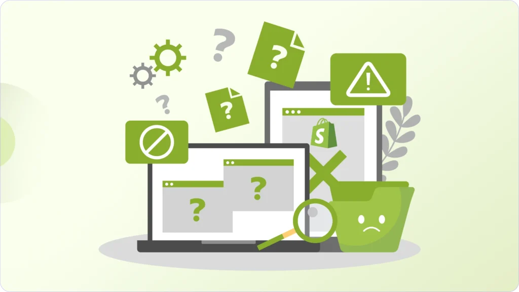
Most conversion issues on Shopify aren’t obvious. You won’t see errors or warnings. Everything technically works, but the experience feels slightly off. And that’s enough for users to hesitate, drop off, and never come back.
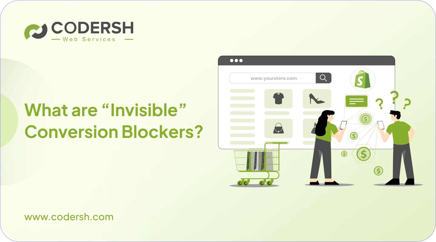
These are what we call invisible Shopify conversion blockers.
In this blog, you’ll understand what they are, how to spot them, and how to fix them based on what actually works in real stores.
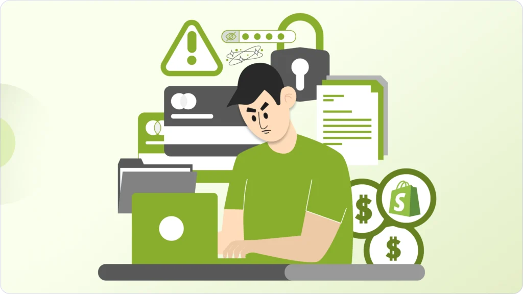
What Are Invisible Conversion Blockers?
These are the kind of problems that don’t break your store, but still hurt your sales.
Everything works the way it should. Pages load, buttons respond, checkout completes. From a technical point of view, nothing looks wrong.
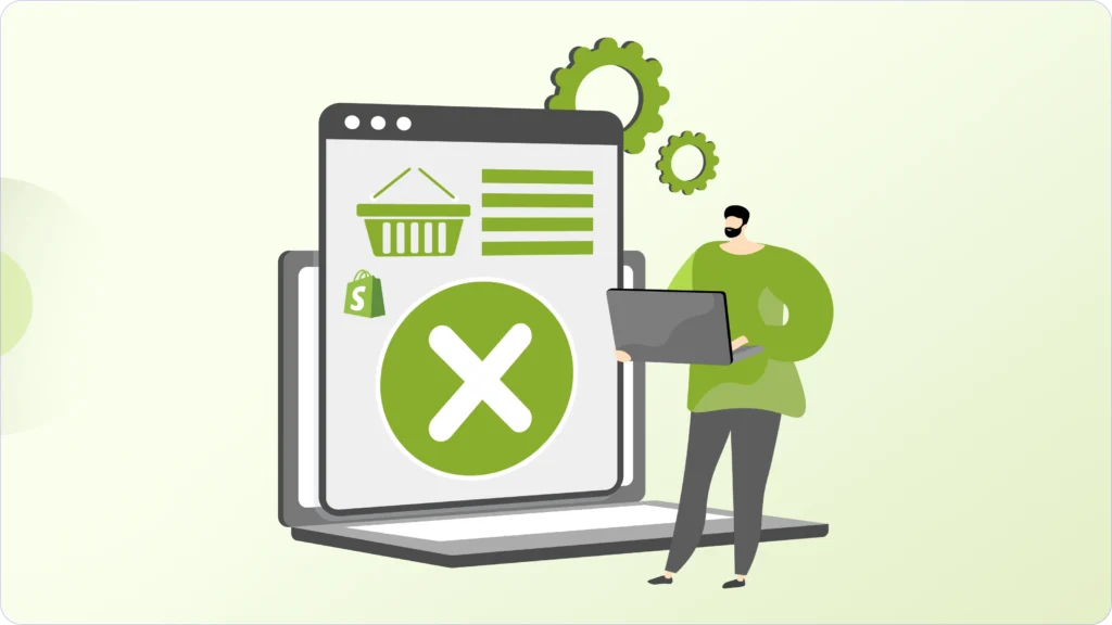
But customers still don’t buy.
You might see traffic coming in, people browsing your products, even spending time on pages, but conversions don’t follow. Mobile visitors might be high, but most purchases still happen on desktop. That’s usually a sign that something subtle is getting in the way.
And most of the time, that “something” is not technical, it’s psychological. Think about how people actually shop online. A user lands on your product page, and within seconds, small questions start popping up in their mind: “Is this brand reliable?” “Is this good enough for me?” “What if I need to return it?”
Now imagine your store doesn’t answer those questions clearly or quickly; nothing will break, but confidence will surely drop.
And when confidence drops, people leave. This is exactly how invisible blockers work. It’s not one big issue. It’s a series of small doubts that build up quietly until the user decides to, “I’ll check this later”, and in e-commerce, “later” usually means “never”.
1. Slow Interactions (Not Just Slow Pages)
Most store owners think speed is only about how fast a page loads. But what really affects conversions is how fast your store responds after it loads.
Imagine this: a customer clicks “Add to Cart”, and nothing happens for a moment. Even if it’s just half a second, their brain immediately questions it: “Did it work? Should I click again?”
That tiny delay creates doubt or when someone is selecting a product variant and the page slightly jumps or reloads awkwardly, it doesn’t feel smooth. It feels unreliable.
We’ve seen stores with good speed scores still struggle with conversions because the experience felt slow in real usage. In most cases, this comes from too many apps running in the background. Each one adds scripts, and together they slow down how quickly the store can respond.
The fix is usually not more optimization tools; it’s simplification. Removing unnecessary apps, reducing script load, and relying more on lightweight custom sections often makes the biggest difference.
Because users don’t measure speed using tools, they measure it by feel.
2. An Unclear Purchase Path
When someone lands on your product page, they shouldn’t have to figure out what to do next.
But many stores unintentionally make users think. You’ll often see pages trying to do too much at once: Multiple buttons, too much content above the main action, or important elements pushed too far down.
A user scrolls, goes back up, checks images again, pauses… not because they’re not interested, but because they’re not fully sure what to do next.
Think of it like walking into a store where no one guides you. Everything is there, but nothing leads you. That’s what an unclear purchase path feels like.
Instead of adding more elements, the goal is to make the decision easier. One clear action, visible at the right time, with supporting information placed where it actually helps.
When the path is obvious, people move forward naturally.
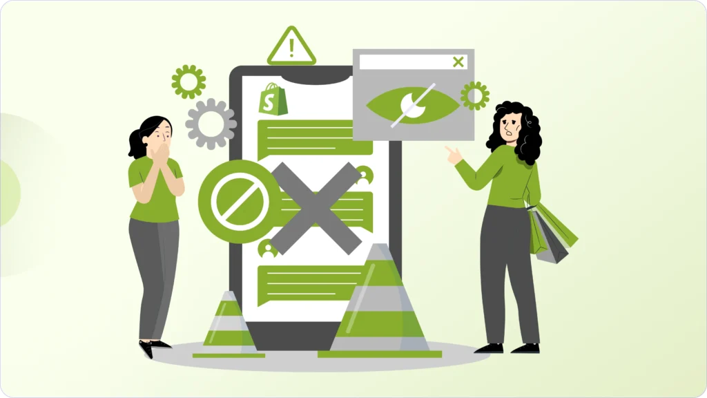
3. Trust Signals That Don’t Actually Build Trust
A lot of stores technically have trust elements like Reviews, badges, and guarantees, but they don’t always work.
Because trust isn’t just about having these fancy titles. It’s about when and how they show up.
For example, if your reviews are placed far below the product description, most users won’t even see them before making a decision or if your page is filled with too many generic trust badges, it can actually feel less credible instead of more.
Now compare that with a simple, clear setup where a user immediately sees a strong rating near the product title, along with clear shipping and return information.
In that case, trust builds almost instantly. A good way to think about it is this: If someone lands on your store, can they trust your brand within a few seconds?
If the answer isn’t yes, your trust signals aren’t doing their job.
4. Mobile UX Gaps (The Quiet Revenue Killer)
Most people will visit your store from their phone. But many stores are still designed like desktop experiences squeezed into a smaller screen.
Nothing feels broken, but everything feels slightly inconvenient, like Buttons are harder to tap, Forms take too long to fill, Popups interrupt at the wrong time, and the layout feels a bit cramped.
Now imagine someone browsing your store while scrolling Instagram. They tap on your product, land on your site, and within a few seconds, it feels like an effort. They won’t complain. They’ll just leave. That’s how mobile friction works.
The best way to catch this is to actually use your store on a real device. Go through the full user journey yourself. Even better, watch real session recordings. You’ll quickly notice where people slow down or drop off.
Most improvements here are simple. Making buttons easier to tap, reducing clutter, shortening forms, and removing aggressive pop-ups can significantly improve conversions.
5. Too Many Apps Doing Too Little
Apps solve problems quickly, which is why most stores rely on them. But over time, they create a different kind of problem.

Each app adds its own scripts, styling, and behavior. Individually, they seem fine. But together, they make the store heavier, slower, and less consistent.
You might not notice it immediately, but users do. The store starts to feel slightly off to them. Different elements behave differently, and Pages take longer to respond.
We often see stores using multiple apps for similar purposes without realizing it. That overlap adds unnecessary complexity.
The best-performing stores are usually simpler than expected. Instead of stacking tools, they focus on what actually drives conversions and remove everything else. In many cases, replacing apps with lightweight custom solutions improves both performance and user experience.
6. Checkout Friction That’s Easy to Miss
Checkout is where everything comes together, and small issues here can quietly cost your sales.
Imagine a customer finally decides to buy, adds a product to the cart, and moves forward. Then suddenly, they see unexpected shipping costs or delivery timelines aren’t clear, or their preferred payment option isn’t available.
Nothing is broken, but confidence drops at the worst possible moment, and once that happens, many users don’t complete the purchase.
The key here is clarity before the final step. When users already know what to expect, checkout feels smooth and predictable.
Even small improvements, like showing shipping details earlier or offering familiar payment options, can make a noticeable difference.
Fixing Conversion Blockers Is an Ongoing Process
Invisible conversion blockers don’t usually come from one big mistake; they build up slowly through small decisions that seem fine in isolation, but together start affecting how your store performs.
That’s why improving conversions isn’t about making one big change. It’s about continuously refining how your store feels to use, how smoothly it flows, and how confidently it guides someone toward a purchase.
When we work with e-commerce brands, the focus is always on consistency. Regular UX and performance audits help uncover what’s quietly slowing things down. Instead of stacking apps, we simplify by building lightweight custom sections that keep the store fast and stable. Design decisions are made around conversions, not just how things look.
And most importantly, everything is tested in real conditions, on real devices, with real user behaviour in mind.
Because in most cases, when traffic is growing, but sales aren’t, the issue isn’t your marketing. It’s what happens after someone lands on your store that needs attention.
Ready to Fix the Conversion Leaks You Can’t See?
If your Shopify store is getting traffic but sales aren’t following, there’s a good chance invisible conversion blockers are holding it back.
Through our CRO-focused Shopify optimization service, we identify and fix the small UX, performance, and technical issues that quietly reduce conversions, without bloating your store with unnecessary apps or surface-level tweaks.
If you want your store to convert the traffic you already have, let us audit your store and remove what’s silently blocking growth.