If your ecommerce site feels even slightly slow, you’re losing money. Not saying this hypothetically, but measurably. Even a one-second delay can impact conversions and increase bounce rates. But the real issue isn’t just speed, it’s perceived friction.
Users don’t analyze load times. They react to how your store feels. If pages are slow to respond, elements shift, or interactions lag, it breaks their flow, and that’s enough for them to leave.
In ecommerce, that moment of hesitation is costly. A fast, smooth experience builds trust, while anything clunky raises doubt.
So instead of chasing generic “speed optimization” tactics, this guide focuses on what actually improves performance in real-world conditions, where users, devices, and intent vary.
1. Start with What Actually Matters: Real User Load Time
Most store owners rely heavily on lab tools like PageSpeed scores. They’re useful for identifying issues, but they don’t tell you how your store actually performs for the people using it.
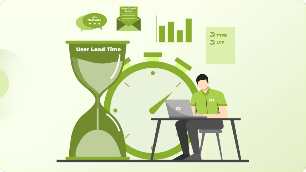
Real users don’t browse under ideal conditions. They’re on mid-range phones, have inconsistent 4G connections, and often multitasking. That’s where performance gaps start to show. A store that scores well on desktop can still feel slow, laggy, or unresponsive in real usage.
This is where your analytics become more valuable than any score. If you’re seeing higher bounce rates on mobile or from specific regions, there’s usually a performance issue underneath it. In most cases, it comes down to slow server response (TTFB), delayed loading of the main visible content (LCP), or pages that take too long before users can actually interact.
And users don’t wait for things to settle. If they can’t see or do something quickly, they leave.
So instead of optimizing for a perfect score, shift your focus to experience. Open your store on a mid-range Android phone, on a normal 4G connection, and go through it like a customer would. If it feels even slightly slow or inconsistent, that’s the real benchmark, and that’s what needs fixing.
2. Fix Your Theme Before Adding Anything Else
Most performance issues don’t come from what you add later; they’re already built into your theme.

A lot of Shopify and WordPress themes are designed to look impressive in demos, not to perform efficiently at scale. They come loaded with heavy sliders, animations, multiple font files, and scripts that run whether you use them or not. It looks polished on the surface, but underneath, it slows everything down.
The problem is once you start building on top of a bloated theme, every app or plugin just adds more weight. You’re essentially stacking optimizations on a weak foundation.
Before installing anything new, take a step back and audit what’s already there. Remove sections you’re not using, strip out unnecessary scripts, limit font variations, and question every visual element that doesn’t directly contribute to conversion.
Because in most cases, a faster store doesn’t come from adding more tools; it comes from removing what shouldn’t have been there in the first place.
3. Reduce App Dependency (This Is Bigger Than You Think)
Apps are one of the most overlooked reasons ecommerce sites slow down over time.

Every app you install doesn’t just “add a feature”; it adds scripts, network requests, and often third-party dependencies that load across your site. Many of these run on every page, whether they’re needed or not. Over time, this builds up into a noticeable delay, especially on mobile.
The bigger issue is that these apps operate independently. They don’t account for each other’s impact, which means you end up with overlapping scripts, duplicated functionality, and unnecessary API calls, all competing for load priority.
This is why stores with 10–15 apps often feel inconsistent. Pages load at different speeds, interactions lag, and small delays start stacking into a poor overall experience.
A better approach is to step back and identify what’s actually core to your business; things like upsells, subscriptions, or custom checkout flows. Instead of relying on multiple apps for these, either consolidate into fewer, well-optimized tools or build them natively where it makes sense.
The improvement isn’t just technical. With fewer moving parts, your store becomes more stable, more predictable, and noticeably faster for the user.
4. Optimize Images the Right Way (Not Just Compression)
Image optimization isn’t just about shrinking file sizes; it’s about how and when those images are delivered.
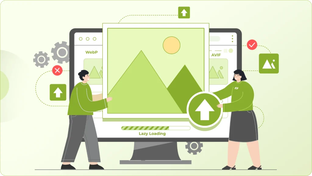
A common pattern in most stores is uploading large images and relying on compression to fix it, or enabling lazy loading without considering what actually needs to load first. That helps, but it doesn’t solve the real problem.
What matters is serving the right image at the right time. That means delivering smaller, responsive images based on the user’s device, using modern formats like WebP or AVIF where supported, and deferring anything that’s not immediately visible on screen.
But the bigger mistake is treating all images equally. Your hero section carries the most weight. It’s the first thing users see, and if that image takes even a couple of seconds to load, the entire page feels slow, regardless of how optimized everything else is.
So the priority should be clear: make above-the-fold content load fast and feel complete. Once that’s smooth, then optimize the rest of the page.
5. Control Your JavaScript (Don’t Let It Control You)
JavaScript is one of the biggest reasons a site feels slow, even when it looks fully loaded.

What users experience isn’t just visual load, it’s interactivity. If scripts are still executing, the browser is busy, and clicks or scrolls don’t respond immediately. That’s when your store starts to feel laggy, even though everything appears “ready.”
This usually happens when too many scripts are competing for priority, especially third-party ones like chat widgets, tracking pixels, and analytics tools. They often load early and block more important interactions.
The fix isn’t to remove JavaScript entirely, but to control when and how it runs. Non-critical scripts should be deferred or delayed until after the main content is usable. Third-party tools should load only when needed, not by default on every page.
Because at the end of the day, speed isn’t just about how fast your site loads; it’s about how quickly a user can actually use it.
6. Fix Mobile Experience First, Not Last
Most ecommerce traffic today comes from mobile, but still many stores are still built and optimized desktop-first. That gap shows up quickly in performance.

On mobile, users deal with slower networks and limited processing power. If your site isn’t designed for that, you’ll see delayed tap responses, layout shifts while loading, and pages that feel heavier than they should.
The mistake is treating mobile as a scaled-down version of desktop. It’s not. Mobile optimization should be about prioritization; what loads first, what’s immediately usable, and what can wait.
Look at your homepage from that lens. Does the essential content appear quickly, or are users waiting through banners, popups, and scripts before they can even start browsing? Every extra layer adds friction.
Because on mobile, speed and usability are tightly connected. Even a technically fast page will struggle if it feels cluttered or blocks users from taking action.
7. Use Smart Caching and a Proper CDN Setup
If your store serves customers across different regions, latency becomes a real issue, just not an obvious one.

Without proper caching and CDN setup, every request has to travel all the way to your origin server and back. That delay might be small locally, but it adds up quickly for users in other geographies. The result is inconsistent load times depending on where your visitors are coming from.
A well-configured CDN solves this by serving your static content, images, scripts, styles from servers closer to the user. It reduces distance, which directly reduces load time.
Caching takes it a step further. Instead of reloading everything on every visit, returning users get a much faster experience because key assets are already stored locally or at the edge.
It’s not something users consciously notice, but they feel the difference. Pages load faster, interactions feel smoother, and the overall experience becomes more reliable, which is exactly what keeps bounce rates down.
8. Eliminate Layout Shifts (This Kills Trust Instantly)
You’ve probably experienced this yourself: you go to click something, and the page suddenly shifts.
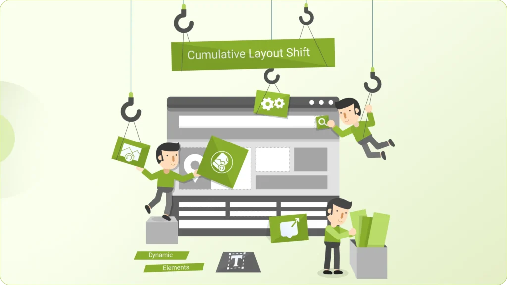
That’s Cumulative Layout Shift (CLS), and it’s one of the fastest ways to break user trust.
It usually comes from things loading unpredictably: images without defined dimensions, fonts swapping late, or dynamic elements like banners and popups pushing content around after the page starts rendering.
The issue isn’t just visual, it’s psychological. When a layout moves unexpectedly, it makes the site feel unstable. Users hesitate, misclick, or lose confidence in what they’re interacting with.
Fixing CLS means making your layout predictable. Reserve space for images and dynamic elements, control how fonts load, and avoid injecting content that disrupts what the user is already viewing.
Because a stable interface doesn’t just look better, it feels reliable. And that directly impacts whether users stay or leave.
9. Clean Up Fonts and Typography Loading
Fonts are easy to overlook, but they directly affect how quickly your content becomes visible.

When your store loads multiple font families and weights, the browser has to fetch and process each of them before rendering text properly. In many cases, this leads to delayed text display or sudden font swaps, both of which disrupt the experience.
The fix is mostly about restraint. Limit the number of font variations you use, avoid loading weights you don’t actually need, and consider system fonts where brand flexibility allows. For custom fonts, preloading only the critical ones ensures your main content appears without delay.
It may seem like a small detail, but it changes how your site feels. Text should appear instantly and consistently because if users are waiting just to read, you’ve already lost their attention.
10. Monitor, Test, and Iterate Continuously
Speed optimization isn’t something you “finish.” It changes every time your store evolves.

Every new app, feature, or design update has an impact; sometimes small, sometimes significant. The problem is, these changes don’t always feel obvious immediately, but over time they compound into slower load times and higher bounce rates.
The stores that stay fast are the ones that treat performance as an ongoing process. They regularly test how pages load across devices, keep an eye on real user behavior, and audit what’s been added or changed over time.
Because speed isn’t just a technical metric sitting in a report, it directly affects how users experience your store. And when you start looking at it as part of your conversion strategy, not just optimization, you make better decisions about what to add, what to remove, and what actually matters.
Final Thought
Speed isn’t about making your site “fast” for the sake of it; it’s about removing friction at every step of the user journey.
When your store loads quickly, responds without delay, and feels stable, users don’t notice performance. They just move forward browsing, exploring, and buying without interruption.
And that’s the real goal.
Lower bounce rates don’t come from trying to hold users’ attention. They come from giving them no reason to leave in the first place.
Thinking About Improving Your Store’s Bounce Rates?
If you’re working on your ecommerce store, speed shouldn’t be treated as a separate technical task.
It directly affects how users experience your site, how quickly they can browse, interact, and move towards a purchase.
In most cases, the issue isn’t one big problem. It’s a combination of small inefficiencies across themes, apps, scripts, and overall setup.