
If you’re still thinking about product pages as “a place to show product details,” you’re already behind.
In 2026, your product page does the job of a salesperson. It replaces the in-store experience, explains the product, handles doubts, builds trust, and guides your customer toward a decision, all in a few scrolls without feeling pushy.
The brands that win today are not the ones with the flashiest designs. They focus on making things clear, reducing hesitation, and helping the customer feel confident about buying.
Let’s break down what that actually looks like.
Your Product Page Has One Job: Remove Uncertainty
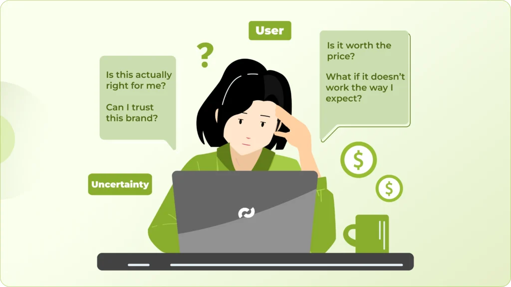
Every person landing on your product page is trying to figure a few things out; they’re thinking:
Is this actually right for me?
Can I trust this brand?
Is it worth the price?
What if it doesn’t work the way I expect?
Most product pages respond to this by trying to “sell harder” with stronger headlines, bigger promises, and more aggressive CTAs. But that’s rarely what the user needs at that moment.
What they actually need is clarity. High-converting product pages are built around this idea. They don’t leave the user guessing or force them to connect the dots. Instead, they guide them step by step, showing the product clearly, explaining how it fits into their life, and addressing concerns before they turn into objections.
For example, if your product is even slightly premium, the user is already questioning the price. If your page doesn’t justify it early, doubt starts building. If your brand is unfamiliar, trust becomes a barrier. If your visuals don’t clearly show how the product looks or works, uncertainty increases.
All of this happens silently, in a matter of seconds.
That’s why the goal of your product page isn’t to impress, it’s to reassure. Every section, every visual, every line of copy should be working toward reducing doubt and making the user feel more confident about moving forward.
When you shift your mindset from “How do I sell this?” to “What might stop someone from buying this?”, your entire page structure starts to improve.
And that’s ultimately what separates average product pages from the ones that consistently convert, not better design, not more content, but fewer unanswered questions.
Above-the-Fold Is Where Decisions Begin (Not End)
Most users don’t read your product page from top to bottom. They scan, judge, and decide very quickly whether it’s worth their time. That decision happens right at the top.
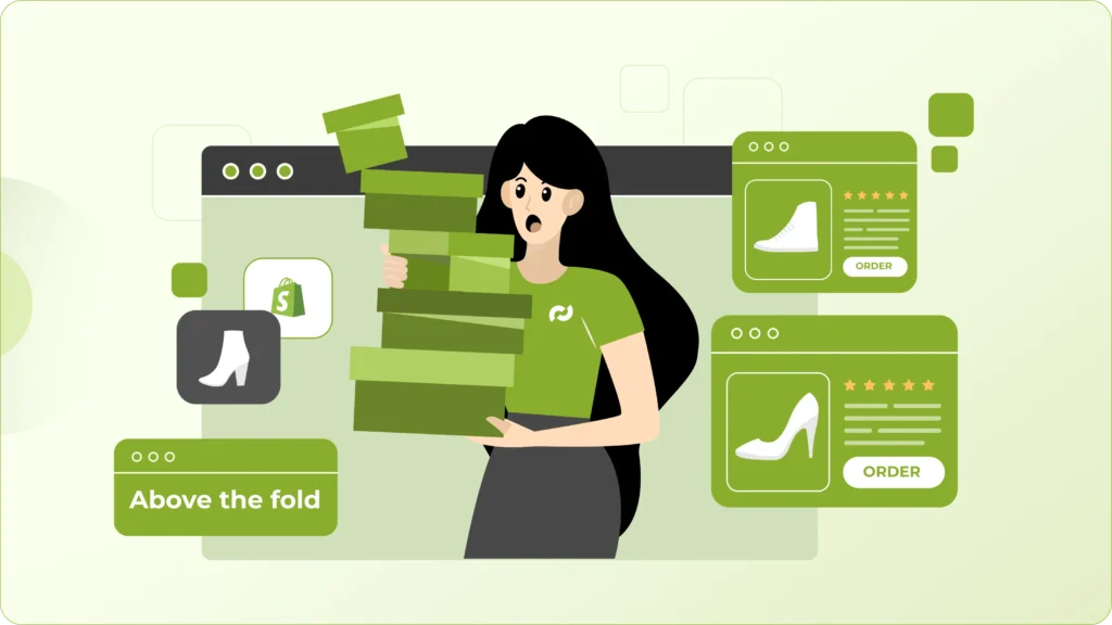
Your above-the-fold section isn’t just about making a good first impression, it determines whether the user continues or leaves. If this part doesn’t make things clear immediately, most people won’t bother scrolling further.
At a minimum, this section needs to answer three basic things without effort: what the product is, why it matters, and whether the brand feels trustworthy.
The problem is, many stores treat this space like a hero banner. They focus on making it look clean or visually appealing, but forget that clarity matters more than creativity here. Aesthetic shots, vague taglines, or overly styled visuals might look good, but they often confuse the user instead of helping them.
What works better is being direct. Your product should be visible in a way that’s easy to understand, not hidden behind angles or effects. The main message should communicate the core outcome or benefit, not just describe the product. And there should be some form of trust signal visible early, whether that’s reviews, ratings, or proof that others have already bought and liked it.
When this section does its job well, the user feels oriented. They understand what they’re looking at and feel comfortable continuing.
If it doesn’t, nothing else on the page really gets a chance to work.
Stop Listing Features. Start Translating Them.
Most product pages still rely heavily on features like materials, specs, technical details. The assumption is that the customer will read them and figure out why they matter.
In reality, that rarely happens. People don’t buy features. They buy what those features do for them. And if that connection isn’t obvious, they won’t take the time to figure it out, they’ll just move on.
Take something simple like “Made with 100% organic cotton.” It sounds good, but it still leaves the user thinking: So what does that actually mean for me?
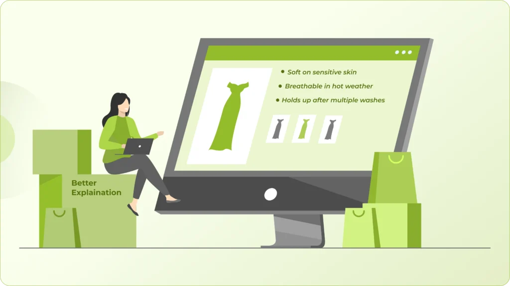
Now compare that to: “Soft on sensitive skin, breathable in hot weather, and holds up even after multiple washes.”
Same product, completely different level of clarity. What changed isn’t the feature, it’s the translation. You’ve taken something technical and turned it into something the customer can immediately relate to. They don’t have to interpret or imagine the benefit anymore. It’s already clear.
This becomes even more important as attention spans keep shrinking. In 2026, users are scanning fast. If your page makes them pause and think too much, that friction adds up quickly and often leads to drop-off.
A well-structured product page does that thinking for the user. It connects the dots upfront, so the value feels obvious without effort.
Because at the end of the day, better explanations convert more than better features.
Visuals Are No Longer Optional, They Are the Experience
You can’t expect users to read their way into a purchase anymore.
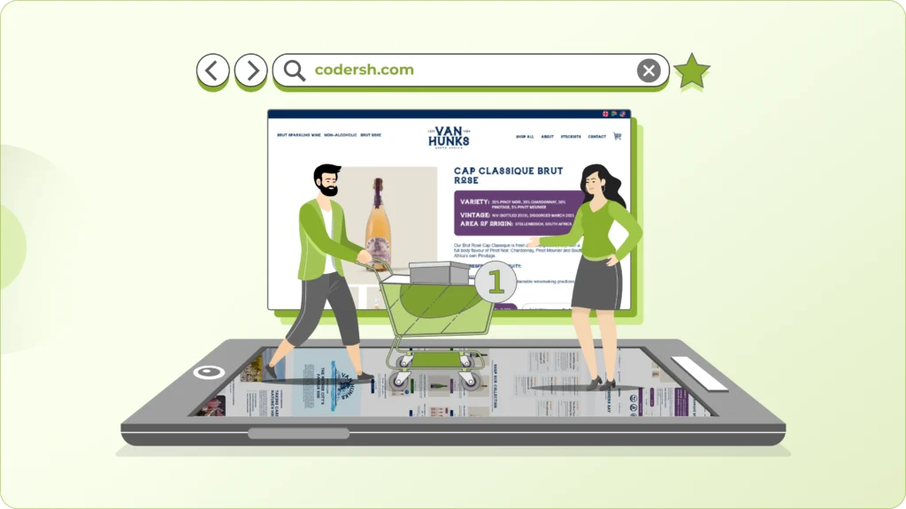
In most cases, they’re trying to see the product, not study it. And if your visuals don’t do the job, no amount of text will compensate for that.
High-converting product pages treat visuals as the main experience, not just supporting elements. They answer questions instantly like what the product looks like, how it fits, how it’s used, and what makes it different.
Think about how users actually behave. They scroll through images first, zoom in, look for details, and try to imagine the product in their own context. If your visuals don’t help them do that, uncertainty builds quickly.
This is where relevance matters more than quantity.
Instead of adding dozens of random images, focus on showing the product in ways that reduce specific doubts. Show it being used in real-life situations so the customer can picture themselves using it. Include close-ups that highlight texture, quality, or craftsmanship. If size or fit could be confusing, make that obvious visually instead of relying on descriptions.
Short videos are becoming especially effective here not polished ads, but simple, clear demonstrations that show how the product works or what results to expect.
When visuals are done right, they do something text can’t: they remove friction instantly.
And if a visual isn’t helping the user understand the product better, it’s not adding value, it’s just taking up space.
Social Proof Needs to Feel Real, Not Placed
People don’t just evaluate your product, they look for reassurance from others who’ve already bought it.

That’s why social proof works. But the way most stores use it actually weakens its impact.
They treat reviews like a checkbox. Add a block of ratings somewhere on the page, show a few stars, and assume it builds trust. In reality, it often feels disconnected like something that’s been placed there, not something that’s helping the user decide.
High-converting product pages handle this differently. They don’t just add reviews, they use them at the right moments.
When a user is looking at the price, they’re wondering if it’s worth it, that’s where a review mentioning value or quality makes a difference. When they’re close to clicking “Add to Cart,” they’re looking for reassurance that others have actually bought and liked the product. When they’re reading product details, they want confirmation that it works as described.
Placing the right kind of feedback at these points removes doubt naturally, without forcing it.
Another mistake is focusing too much on numbers. A large number of 5-star ratings looks good, but it doesn’t always build confidence on its own. What actually converts are reviews that feel real, ones that talk about specific use cases, problems, or results.
A customer explaining how the product solved their problem, how it felt to use, or what surprised them carries far more weight than dozens of generic “Great product” comments.
In the end, social proof works best when it feels like part of the decision-making process, not an add-on.
Your CTA Isn’t Weak, The Context Around It Is
When conversions drop, most people immediately start tweaking the CTA, changing the button color, rewriting the text, trying something more “catchy.”
But that’s rarely where the real problem is. Users don’t hold back because your button says “Buy Now” instead of “Get Yours.” They hold back because they’re not fully convinced yet. Something still feels unclear, incomplete, or risky.
And no CTA can fix that.
By the time someone reaches your call-to-action, the decision should already feel close. The CTA isn’t there to persuade, it’s there to capture intent that already exists. That only happens when the rest of your page has done its job properly.
The user should already understand what they’re getting, why it’s a better choice compared to other options, and what happens if things don’t go as expected. If even one of these feels uncertain, hesitation creeps in right at the moment of action.
This is why simply “optimizing” the button often leads to small, inconsistent results. You might see slight improvements, but they don’t last, because the root issue hasn’t been addressed.
Instead of focusing on the CTA itself, look at what comes before it like: Does your page build enough clarity and confidence? Does it remove doubts before asking for action? Does the user feel ready, or are they still evaluating? When the context is strong, almost any clear CTA will work. When it’s not, even the best-designed button won’t convert reliably.
Pricing Transparency Builds More Trust Than Discounts
Discounts can definitely grab attention. They can increase clicks and even drive short-term sales.
But when they’re used too often, they start doing the opposite of what you want ,they reduce trust.
Users begin to question the real value of your product. Is this actually worth the original price? Or is the pricing just inflated to make the discount look attractive? That doubt becomes a problem, especially if you’re trying to build a long-term brand and not just chase quick conversions.
What’s working better in 2026 is a shift in approach. Instead of trying to lower the price, high-performing brands focus on making the price make sense.
They take the time to explain what goes into the product like the materials, the process, the quality, or even the thinking behind it. They help the customer understand why it costs what it does, instead of expecting them to accept it blindly.
This becomes even more important when you’re not the cheapest option in the market. If a user is comparing you with a lower-priced alternative, they’re already looking for reasons to justify the difference. If your page doesn’t provide those reasons, price becomes the only deciding factor.
But when you clearly show the value behind the price, the conversation changes. It’s no longer “Why is this expensive?” it becomes “Okay, I see why this costs more.”
And that shift doesn’t just improve conversions. It attracts a different kind of customer someone who values quality, understands what they’re paying for, and is far less likely to hesitate or churn later.
In the long run, that’s far more valuable than a temporary spike from discounts.
Mobile Optimization Is Not a Checkbox Anymore
Most of your traffic is already coming from mobile, but many product pages are still designed like desktop pages squeezed into a smaller screen. That’s where things start to break.
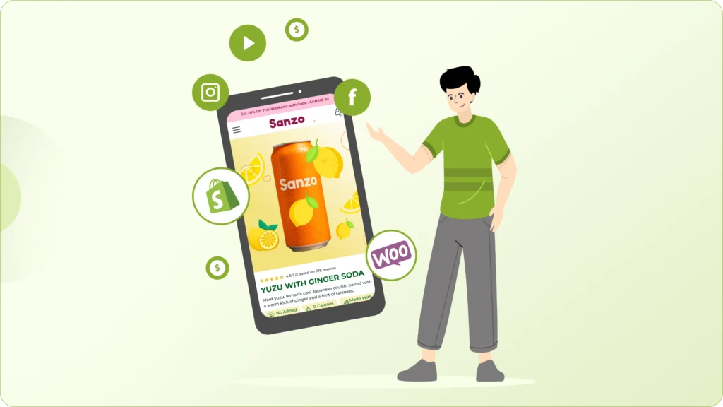
Mobile design isn’t about shrinking layouts. It’s about deciding what actually matters and making it easy to access without effort. On a small screen, attention is limited and patience is even lower, so every element needs to earn its place.
Think about how people use their phones. They’re scrolling quickly, often with one hand, and looking for immediate clarity. If key information is buried, if buttons are hard to reach, or if content feels cramped, the experience becomes frustrating very quickly.
High-converting mobile pages feel simple and effortless. The important details are easy to spot, the interactions feel natural, and taking action doesn’t require extra steps. A well-placed sticky add-to-cart can help, but only if it doesn’t get in the way. Spacing, readability, and loading speed matter even more here because there’s less room for error.
Where many stores lose conversions is in small, avoidable issues, users having to zoom in to read text, scroll too much to find key details, or struggle to understand how the product looks and works on a smaller screen.
These aren’t obvious problems when you’re building the page, but they add up quickly for the user. And when the experience feels even slightly difficult, people don’t complain they just leave.
Returns, Guarantees, and Risk Reversal Matter More Than Ever
When someone is close to buying, they’re not just thinking about the product anymore, they’re thinking about what could go wrong like: What if it doesn’t match expectations? What if the size is off? What if returning it is a hassle?
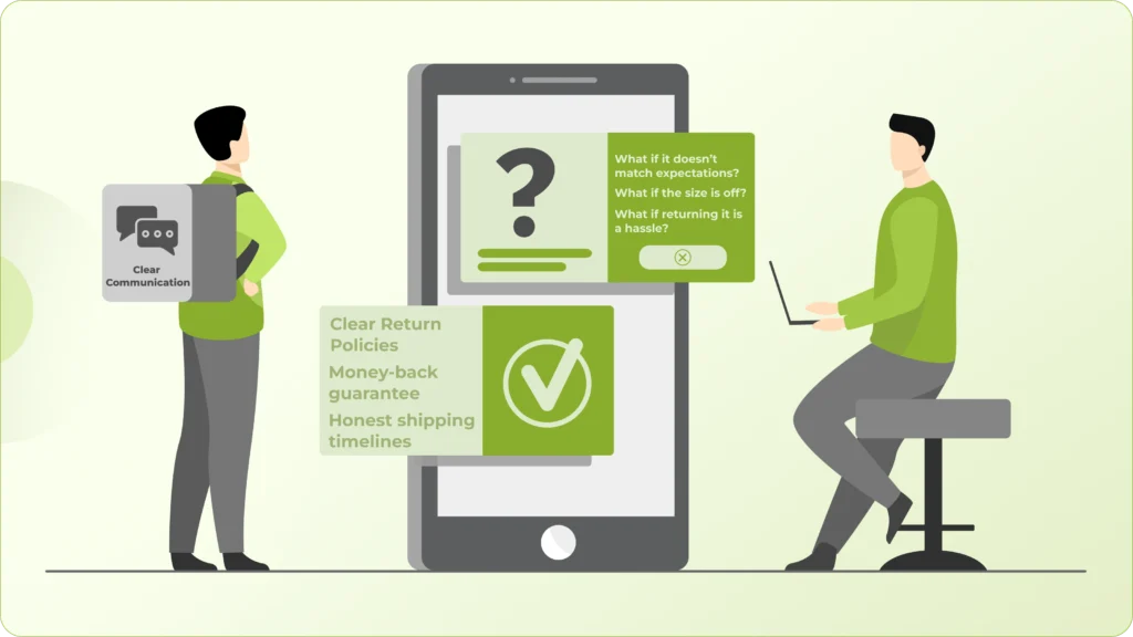
This is where a lot of product pages fall short. They focus heavily on selling the upside, but ignore the concerns that show up right before the decision.
Simple things like clear return policies, a straightforward money-back guarantee, or honest shipping timelines don’t feel exciting, but they play a huge role in conversions. They reduce the sense of risk, which is often the final barrier to purchase.
And this isn’t just about adding the information somewhere on the page. It needs to be easy to find and easy to understand. If users have to dig through FAQs or fine print to feel reassured, that doubt doesn’t go away.
What works better is being upfront. When you clearly communicate what happens if things don’t go as planned, it builds trust. It shows that you’re confident in your product and not trying to trap the customer into a decision.
There’s also a simple psychological shift here when it feels easy to undo a purchase, people feel more comfortable making it in the first place.
And in many cases, that’s all they need to move forward.
Personalization Is Emerging, But Relevance Still Wins
There’s a lot of noise around personalization right now like AI-driven recommendations, dynamic content, behavior-based product pages.
And yes, these things are growing But here’s the reality most stores overlook: you don’t need complex personalization to improve conversions. In many cases, it’s not even the bottleneck.
What actually moves the needle is something much simpler: relevance.
If your product page clearly speaks to a specific type of customer, addresses a specific problem, and answers the doubts that customer is likely to have, it will outperform a generic page trying to adapt to everyone.
This is where many brands go wrong. They try to keep their messaging broad so it appeals to a wider audience. But in doing that, the page becomes less convincing for anyone in particular.
A generic “personalized” experience still feels generic if the core message isn’t sharp.
On the other hand, a well-focused product page feels personal even without any dynamic elements. The user reads it and thinks, “This is exactly what I was looking for.”
That level of clarity and alignment builds far more confidence than showing a few recommended products or adjusting content based on behavior.
So before thinking about advanced personalization tools, it’s worth asking a simpler question: Does your product page feel relevant to the person you actually want to sell to? Because when it does, you don’t need much else to drive conversions.
Final Thought
A high-converting product page isn’t trying to look impressive, it’s trying to make the decision feel simple. That shift in mindset changes how you approach everything.
Instead of thinking in terms of sections, layouts, or what “should” be included, you start thinking about the person on the other side. What are they unsure about? What might hold them back? What do they need to feel confident moving forward?
When you build your page around those questions, things naturally fall into place.
Your layout stops feeling random and starts guiding the user. Your content becomes more direct because it’s answering real concerns, not filling space. And instead of hoping users convert, you can start to see why they do or why they don’t.
That’s what makes conversions more consistent. Not hacks, not trends, just a clearer, more intentional buying experience.
Thinking About Improving Your Product Pages?
If your product pages are getting traffic but not converting, the issue is rarely just design.
It’s usually about clarity, structure, and how effectively your page addresses real customer concerns.